Source: Articles on Smashing Magazine — For Web Designers And Developers | Read More
In many companies, data, findings, and insights are all used interchangeably. Slack conversations circle around convincing data points, statistically significant findings, reliable insights, and emerging trends. Unsurprisingly, conversations often mistake sporadic observations for consistent patterns.
But how impactful is the weight that each of them carries? And how do we turn raw data into meaningful insights to make better decisions? Well, let’s find out.

Why It All Matters
At first, it may seem that the differences are very nuanced and merely technical. But when we review inputs and communicate the outcomes of our UX work, we need to be careful not to conflate terminology — to avoid wrong assumptions, wrong conclusions, and early dismissals.

When strong recommendations and bold statements emerge in a big meeting, inevitably, there will be people questioning the decision-making process. More often than not, they will be the loudest voices in the room, often with their own agenda and priorities that they are trying to protect.
As UX designers, we need to be prepared for it. The last thing we want is to have a weak line of thinking, easily dismantled under the premise of “weak research”, “unreliable findings”, “poor choice of users” — and hence dismissed straight away.
Data ≠ Findings ≠ Insights
People with different roles — analysts, data scientists, researchers, strategists — often rely on fine distinctions to make their decisions. The general difference is easy to put together:

Here’s what it then looks like in real life:
Only insights create understanding and drive strategy. Foresights shape strategy, too, but are always shaped by bets and assumptions. So, unsurprisingly, stakeholders are interested in insights, not findings. They rarely need to dive into raw data points. But often, they do want to make sure that findings are reliable.
That’s when, eventually, the big question about statistical significance comes along. And that’s when ideas and recommendations often get dismissed without a chance to be explored or explained.
But Is It Statistically Significant?
Now, for UX designers, that’s an incredibly difficult question to answer. As Nikki Anderson pointed out, statistical significance was never designed for qualitative research. And with UX work, we’re not trying to publish academic research or prove universal truths.
What we are trying to do is reach theoretical saturation, the point where additional research doesn’t give us new insights. Research isn’t about proving something is true. It’s about preventing costly mistakes before they happen.

Here are some useful talking points to handle the question:
And: it might not be necessary to focus on the number of participants, but instead, argue about users consistently struggling with a feature, mismatch of expectations, and a clear pattern emerging around a particular pain point.
How To Turn Findings Into Insights
Once we notice patterns emerging, we need to turn them into actionable recommendations. Surprisingly, this isn’t always easy — we need to avoid easy guesses and assumptions as far as possible, as they will invite wrong conclusions.
To do that, you can rely on a very simple but effective framework to turn findings into insights: What Happened + Why + So What:
To better assess the “so what” part, we should pay close attention to the impact of what we have noticed on desired business outcomes. It can be anything from high-impact blockers and confusion to hesitation and inaction.
I can wholeheartedly recommend exploring Findings → Insights Cheatsheet in Nikki Anderson’s wonderful slide deck, which has examples and prompts to use to turn findings into insights.
Stop Sharing Findings — Deliver Insights
When presenting the outcomes of your UX work, focus on actionable recommendations and business opportunities rather than patterns that emerged during testing.
To me, it’s all about telling a good damn story. Memorable, impactful, feasible, and convincing. Paint the picture of what the future could look like and the difference it would produce. That’s where the biggest impact of UX work emerges.
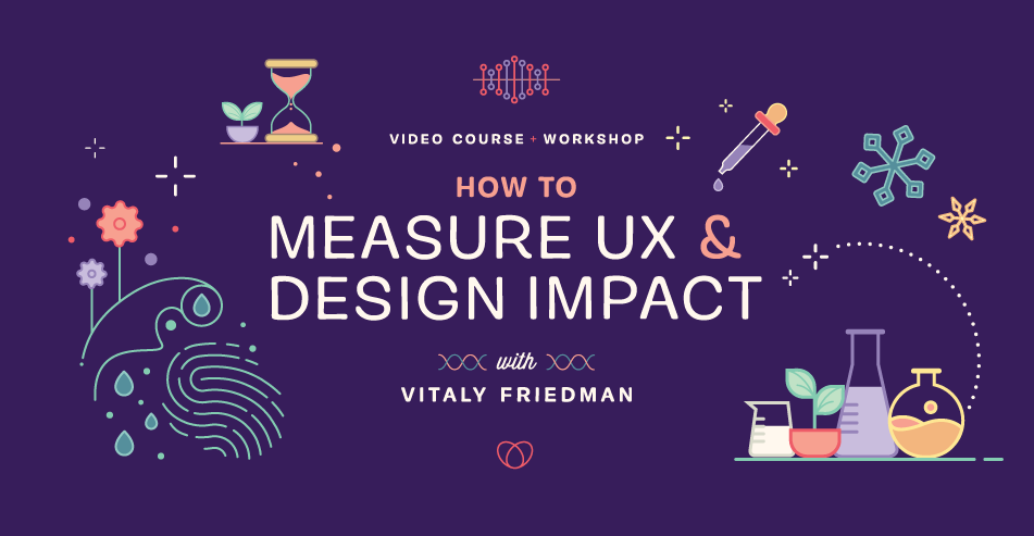
How To Measure UX And Design Impact
Meet Measure UX & Design Impact (8h), a practical guide for designers and UX leads to shape, measure, and explain your incredible UX impact on business. Recorded and updated by Vitaly Friedman. Use the friendly code 🎟 IMPACT to save 20% off today. Jump to the details.
$ 495.00 $ 799.00
Get Video + UX Training
25 video lessons (8h) + Live UX Training.
100 days money-back-guarantee.
25 video lessons (8h). Updated yearly.
Also available as a UX Bundle with 2 video courses.