Source: Articles on Smashing Magazine — For Web Designers And Developers | Read More
First, a recap:
Ambient animations are the kind of passive movements you might not notice at first. However, they bring a design to life in subtle ways. Elements might subtly transition between colours, move slowly, or gradually shift position. Elements can appear and disappear, change size, or they could rotate slowly, adding depth to a brand’s personality.
In Part 1, I illustrated the concept of ambient animations by recreating the cover of a Quick Draw McGraw comic book as a CSS/SVG animation. But I know not everyone needs to animate cartoon characters, so in Part 2, I’ll share how ambient animation works in three very different projects: Reuven Herman, Mike Worth, and EPD. Each demonstrates how motion can enhance brand identity, personality, and storytelling without dominating a page.
Reuven Herman
Los Angeles-based composer Reuven Herman didn’t just want a website to showcase his work. He wanted it to convey his personality and the experience clients have when working with him. Working with musicians is always creatively stimulating: they’re critical, engaged, and full of ideas.
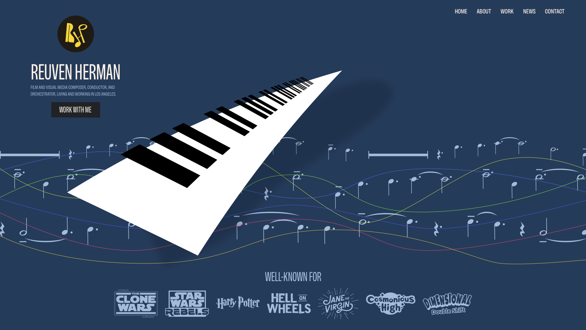
Reuven’s classical and jazz background reminded me of the work of album cover designer Alex Steinweiss.
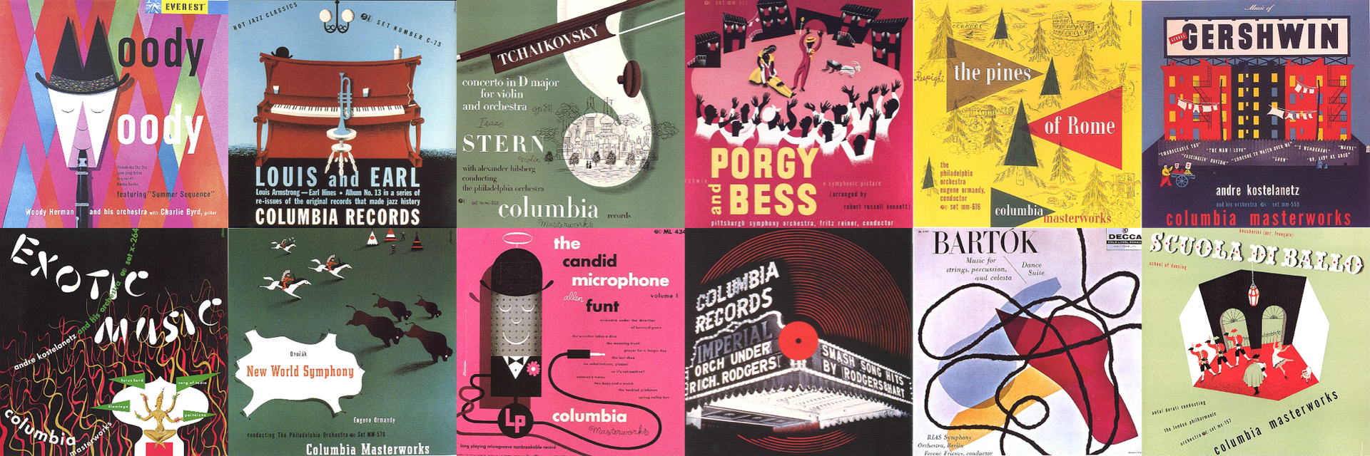
I was inspired by the depth and texture that Alex brought to his designs for over 2,500 unique covers, and I wanted to incorporate his techniques into my illustrations for Reuven.
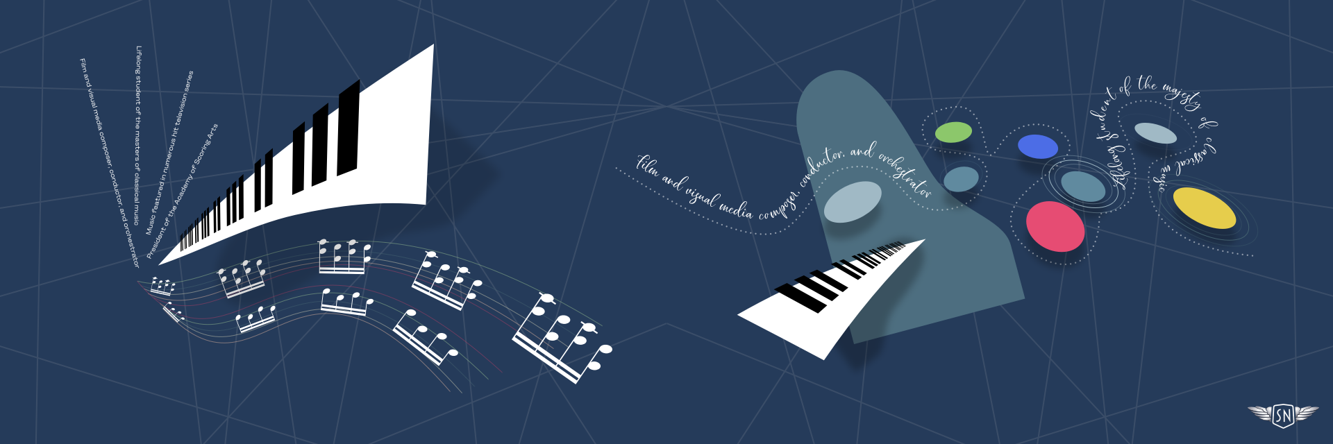
To bring Reuven’s illustrations to life, I followed a few core ambient animation principles:
…followed by their straight state:
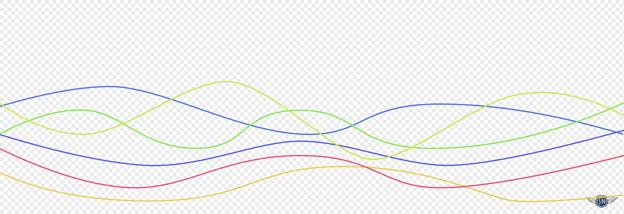
The first step in my animation is to morph the stave lines between states. They’re made up of six paths with multi-coloured strokes. I started with the wavy lines:
<!-- Wavy state -->
<g fill="none" stroke-width="2" stroke-linecap="round">
<path id="p1" stroke="#D2AB99" d="[…]"/>
<path id="p2" stroke="#BDBEA9" d="[…]"/>
<path id="p3" stroke="#E0C852" d="[…]"/>
<path id="p4" stroke="#8DB38B" d="[…]"/>
<path id="p5" stroke="#43616F" d="[…]"/>
<path id="p6" stroke="#A13D63" d="[…]"/>
</g>
Although CSS now enables animation between path points, the number of points in each state needs to match. GSAP doesn’t have that limitation and can animate between states that have different numbers of points, making it ideal for this type of animation. I defined the new set of straight paths:
<!-- Straight state -->
const Waves =
  p1: "[…]",
  p2: "[…]",
  p3: "[…]",
  p4: "[…]",
  p5: "[…]",
  p6: "[…]"

animateRandomDots()
The result is a skyline that gently flickers, as if the city itself is alive. Finally, I rotated the wheel. Here, there was no need to use GSAP as this is possible using CSS rotate alone:
<g id="banner-wheel">
  <path stroke="#F2F2F2" stroke-linecap="round" stroke-width="4" d="[…]"/>
  <path fill="#D8F76E" d="[…]"/>
</g>

#banner-wheel
  transform-box: fill-box;
  transform-origin: 50% 50%;
  animation: rotateWheel 30s linear infinite;


@keyframes rotateWheel
  to  transform: rotate(360deg);
CSS animations are lightweight and ideal for simple, repetitive effects, like fades and rotations. They’re easy to implement and don’t require libraries. GSAP, on the other hand, offers far more control as it can handle path morphing and sequence timelines. The choice of which to use depends on whether I need the precision of GSAP or the simplicity of CSS.
By keeping the wheel turning and the circles glowing, the skyline animations stay in the background yet give the design a distinctive feel. They avoid stock photo clichés while reinforcing EPD’s brand identity and are proof that, even in a conservative sector like property investment, ambient animation can add atmosphere without detracting from the message.
Wrapping up
From Reuven’s musical textures to Mike’s narrative-driven Orango Jones and EPD’s glowing skylines, these projects show how ambient animation adapts to context. Sometimes it’s purely atmospheric, like drifting notes or rotating wheels; other times, it blends seamlessly with interaction, rewarding curiosity without getting in the way.
Whether it echoes a composer’s improvisation, serves as a playful narrative device, or adds subtle distinction to a conservative industry, the same principles hold true:
Keep motion slow, seamless, and purposeful so that it enhances, rather than distracts from, the design.