

Source: Medium.design - Medium | Read More
Alright, yes, we changed the logo again. Sort of. But not really that much at all. It’s for a good reason, we promise. Hear us out.
This year has been one of the biggest in Medium’s twelve-year history. Throughout that time, we’ve made one thing clear: we believe the future of a better internet is one in which human writing can thrive without ads, spam, or fraud, where you can deepen your understanding of the world around you.
As the state of the internet quickly and radically changed around us, we’ve had a lot of internal discussions about who we are and where we stand. Naturally, some questions about branding began to bubble up. Did Medium’s current logo reflect our new reality, and more importantly, the future where we’re headed? Were we happy with what the ellipsis symbol said about us? Did we want to make a change?
Our answer at the beginning of the year, was a short and simple “no, it’s fine.”
As time went on, the tide started shifting. While some of us (like myself) were neutral, and others truly loved the mark, there was a growing sentiment that the ellipsis didn’t represent what Medium was, at least not as clearly as it could. The symbol was an abstracted punctuation mark, which, to a lot of Medium staff, signaled a vague sense of hesitancy and uncertainty. While beautiful on its own as a piece of design, its meaning wasn’t clear.
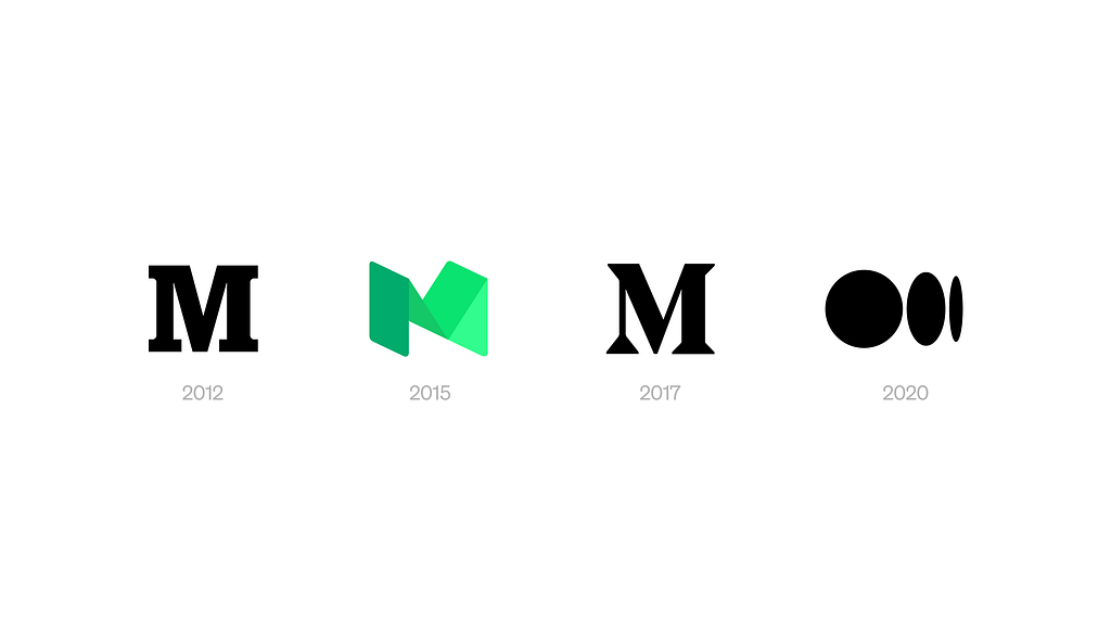
Let’s be honest though: Medium has gone through a lot of logos in a relatively short time. It’s a running joke at this point. But as we all know, time moves differently on the internet, and things change quickly. The decision to rebrand isn’t one based on some rulebook or scientific method, but rather, its an emotional signifier of a change in trajectory. We felt that Medium’s change in trajectory and momentum is now.
So what was the next step? Well, it’s clear that Medium does have a legacy of typographic logos. Medium is an inherently typographic platform, after all. So should we just go back to an M? Should we spend additional time and resources designing a new one from scratch? Or is there a simple experiment we could try with what we already have? What if we just dropped the ellipsis and see what happens?
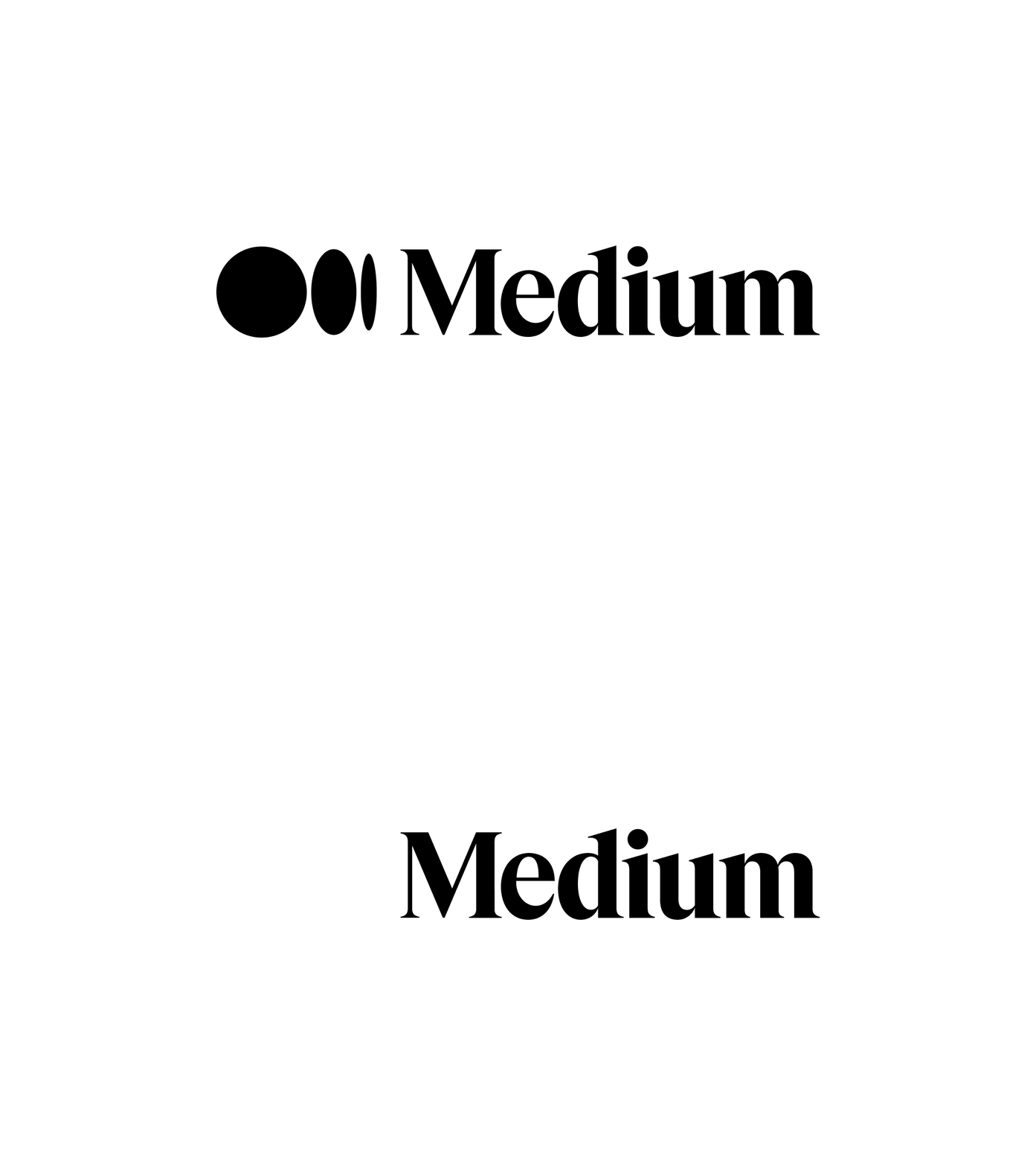
Earlier this year, we started using the existing Medium wordmark, alone, on a few blog images and internal design assets. The wordmark is a great piece of type design, modified from Grilli Type’s beautiful GT Super, which has roots in print design from the 70s and 80s.
Using the wordmark alone is an honest and literal embrace of what makes Medium so special: the human-written (well, typed) word.
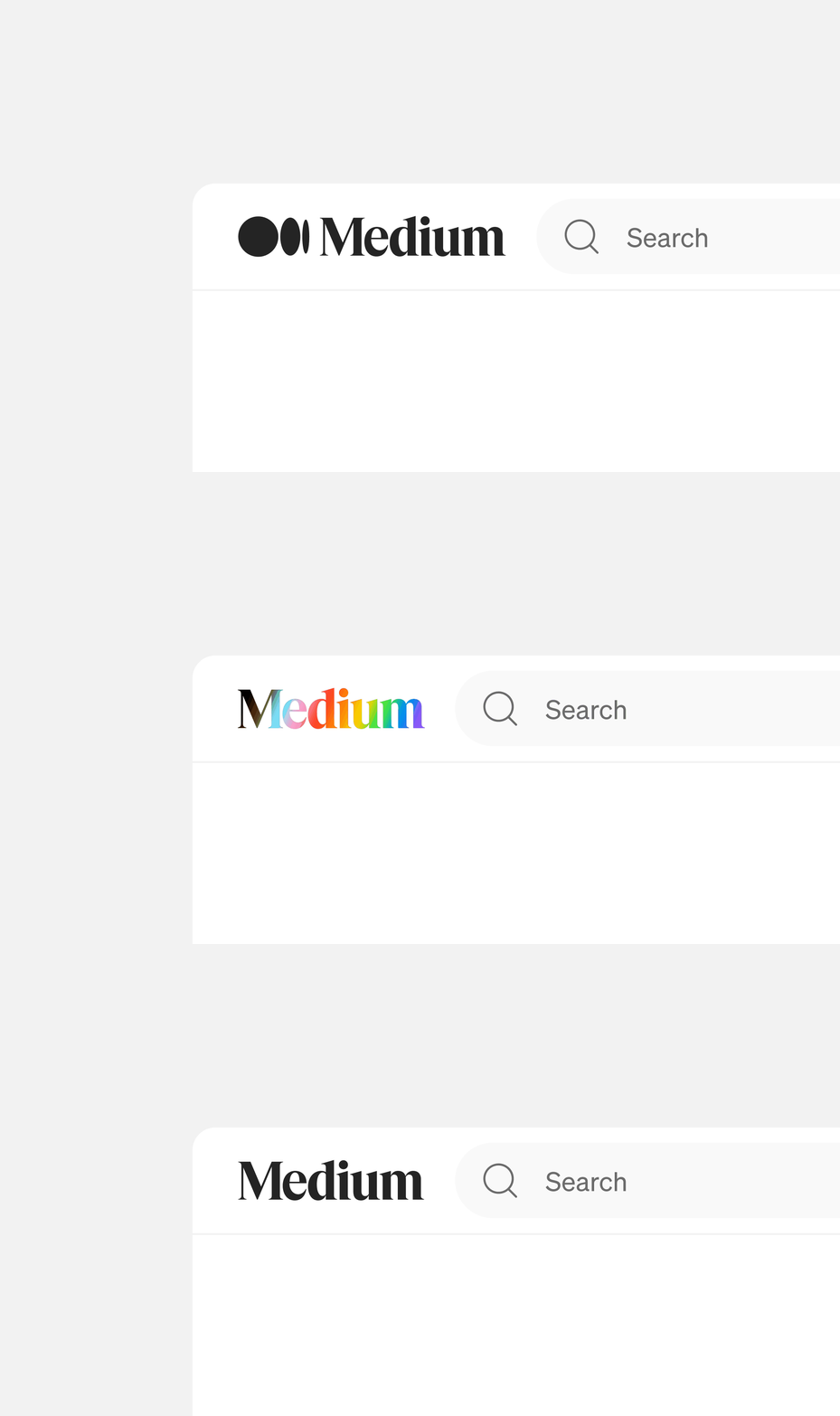
Great, decision made. Dropping the ellipsis should be a simple change. Anywhere the ellipsis and wordmark are together, we can remove the symbol. In places like the top navigation on web, where we have responsive space, let’s swap the standalone symbol for the standalone wordmark. Easy enough, right?
But what about places like the mobile app icon and our user avatars, where we need something to fit into an enclosed, 1:1 ratio container? Should we just squeeze the entire wordmark into that space?
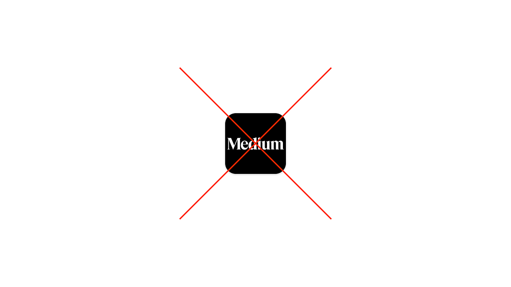
Well… probably not.
So what were our options? Back in April, we launched custom app icons for Friends of Medium. Although we launched with ten designs, there were a lot of design explorations that centered around variations of the Medium logo.
Along with our “throwback” options using past logos, we wanted to consider what a fresh take on our current app icon could be outside of the ellipsis symbol. Naturally, we tried just using the M from the wordmark. I mean, we’ve used an M before, why not just do that?
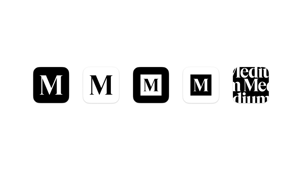
The simple M in a box felt a little too reminiscent of our 2017 logo, and reverting to a past version just felt wrong given we’re trying to move forward. The M on its own is totally fine and could work. But is it distinct enough? Does it make you think of “Medium” when you see it? How many other companies are out there using an “M” for a logo? Would it be quickly identifiable on a home screen filled with other apps? And isn’t it just… a little boring?
What if we did something unconventional instead?
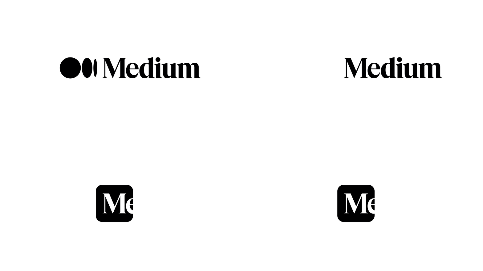
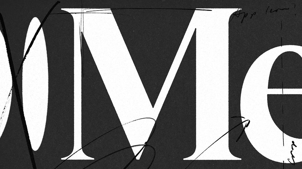
By centering the M and allowing the e to get cut in half by the edge of the container, we’re implying there’s more beyond the frame, and more to the story. The Gestalt psychological principle of reification, or closure, lets your mind fill in the rest of the word subconsciously. Most companies center their logo with plenty of padding around the sides, but Medium isn’t like most companies. It reading as “Me” is no accident, either: Medium is uniquely a place for first-person perspectives.
We introduced this design as one of our custom app icons back in April, and we found that a lot of staff had changed theirs to the wordmark. We sat with it for a couple of months until we ultimately decided “something feels right about this.”
So began a collaboration between brand, product design, and engineering to implement the changes across the product.
Moving forward, we developed a pretty simple rule for implementation: If the container is 1:1 and enclosed, use the cropped wordmark. Anywhere else, make the full wordmark work.
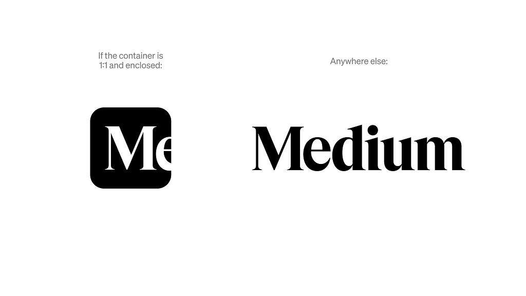
There are a lot of instances of the logo around the product and around the web at large. Where do we start?
In June, we had an opportunity to experiment with our logo as we celebrated Pride Month. After some design iteration, we landed on an option we loved using the wordmark on its own. After pride, we had a decision to make: would we go back to using the ellipsis, or is this the moment we start to make a real change?
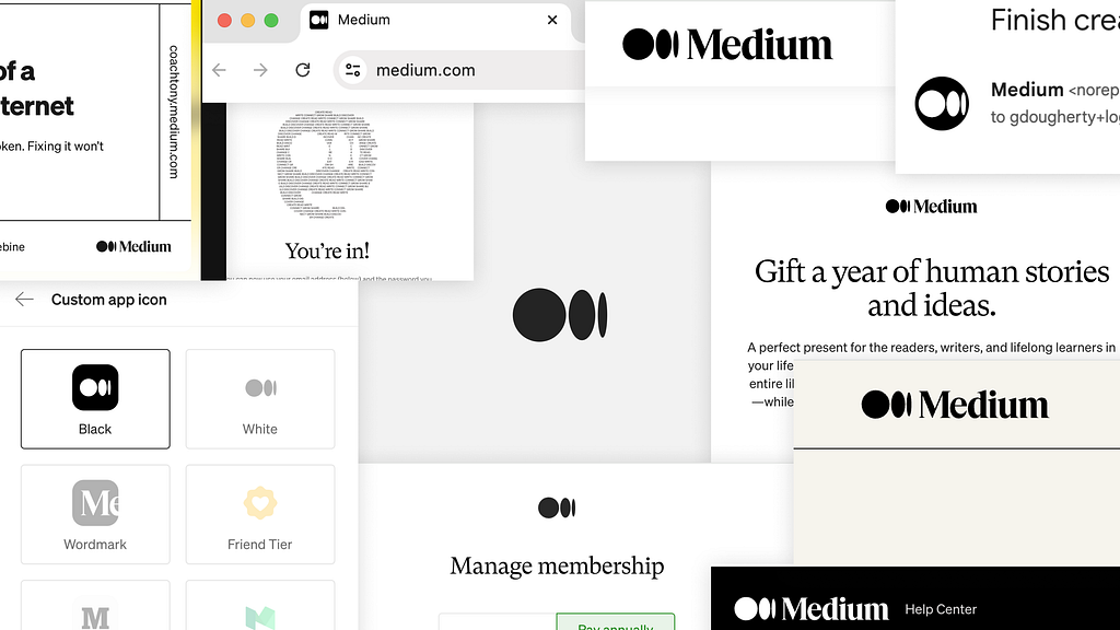
From there, we did a massive audit of every instance the logo appears and made a plan to tackle them in phases over the course of July and August, and finished implementing the changes by August 17th to coincide with the Medium Day keynote.
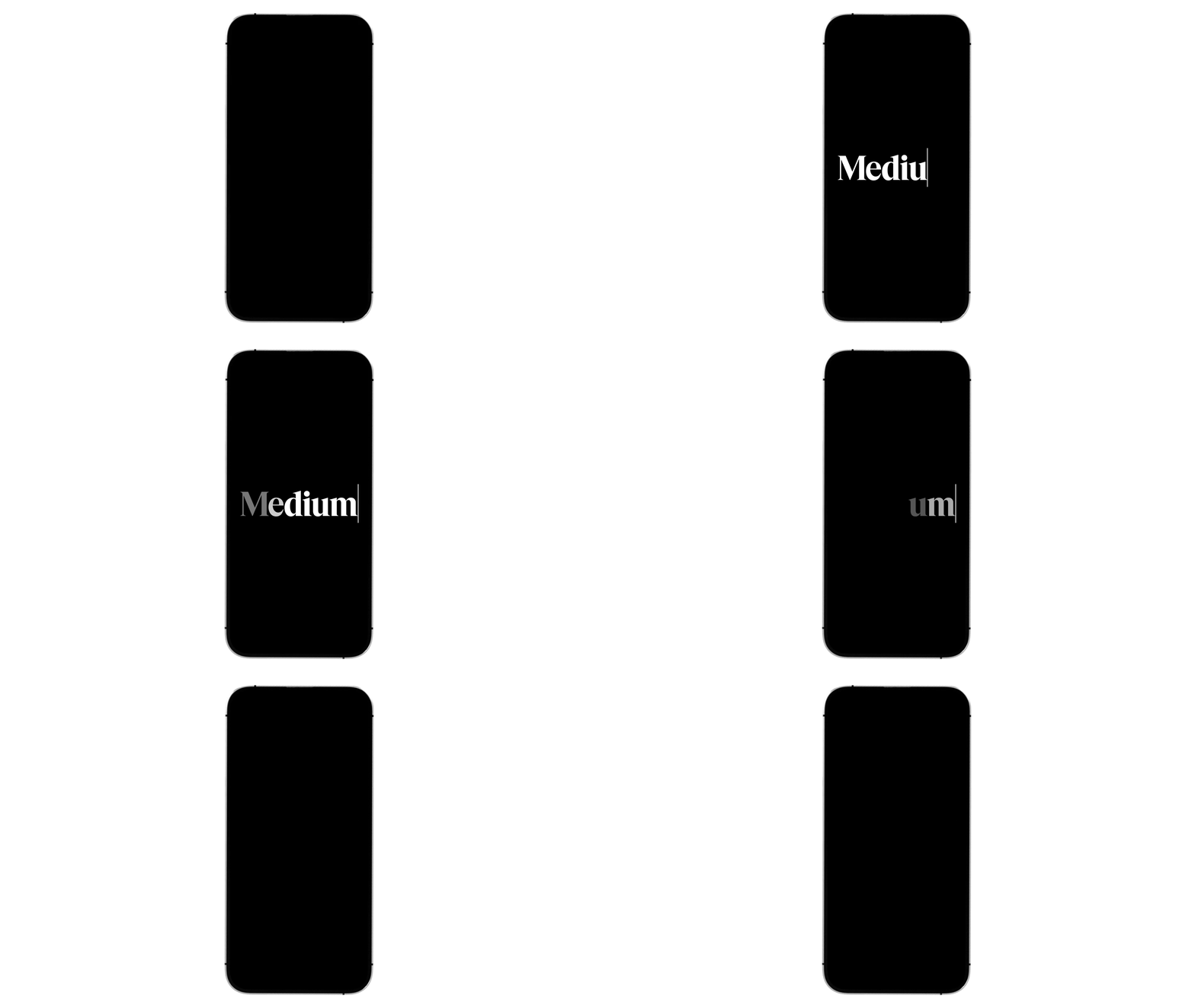
One of the most unique (and briefly seen) instances of our logo is the splash animation that plays when you open the mobile app. This animation needs to be fast, and not impede any load time for the app. So just like our previous logo animation, we kept it under one second in length. But how should we animate a logo that’s just type? Just… type… just… type…
We’re excited about what this move means for Medium’s visual identity. It’s an intentional and genuine move toward representing what Medium truly is as a platform for human writing.
Just like with the product itself, we’re continuing to experiment and iterate to find what feels right. Keen eyes might have noticed a shift away from the text-based ASCII-style illustrations from our 2020 brand. We’re embracing a warmer, more human approach on surfaces like our logged-out homepage and the most recent featured images on our blog. More on that in the future. But importantly, we’re moving things around in real-time, piece-by-piece, and seeing what sticks.
This refresh is a small, but confident reaffirmation. In a noisy internet full of spam, fraud, and AI generated content, we believe in the power of words. So we’re putting text first.
You can find our updated logo assets and some guidance on usage here.
About Medium’s new(ish) logo was originally published in Medium.design on Medium, where people are continuing the conversation by highlighting and responding to this story.