
Source: Medium.design - Medium | Read More
It’s been a minute since we last shared a batch of design inspiration — so here’s a January edition for you! In no particular order, here are a few things that have been shared around our team over the past several months.
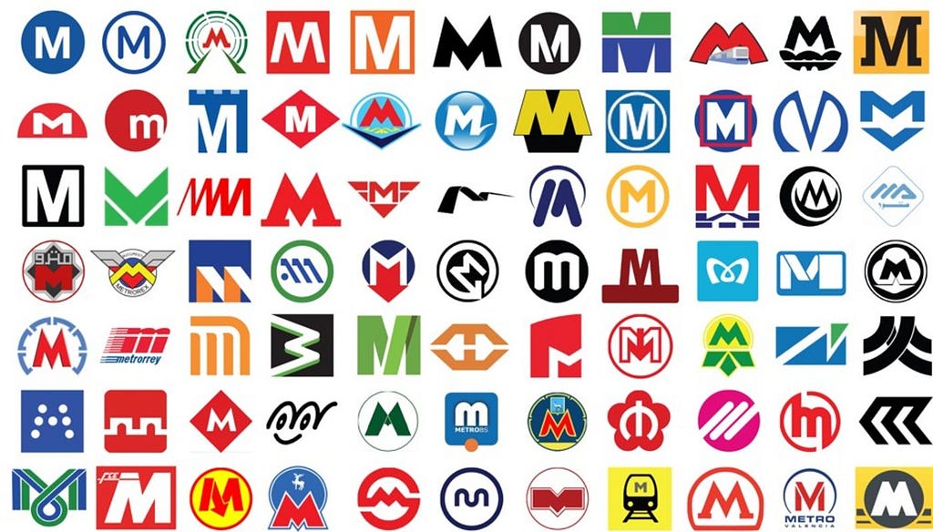
Some good, old-fashioned transit branding inspiration. Reminds me that there are infinite variations possible on even the most straightforward / fundamental design components.

A really thoughtful realization of book browsing in a digital space. I especially love a few details that simulate physical book-browsing: the spines of each book being slightly different widths, and the hover state on the landing page that “pulls” the book towards you.
Stripe Press - Ideas for progress
We love a drag and drop website builder! This one is interesting for its mobile-first approach.
mmm.page - Dead Simple, Drag & Drop Websites
A homepage that feels “like an amusement park,” and also just a nice example of using type as a visual asset.
More type! But this one’s a fun crash-course in design fundamentals when working with typography, like alignment and contrast. Scroll slowly so you don’t get dizzy.
Speaking of inspiration, am I the only one who hasn’t been using Are.na until now? Yes? Dropping it here in case, like me, you haven’t caught on yet. It’s a super useful tool for cataloging inspiration / organizing your thoughts visually.
Design Inspiration, 1.19 was originally published in Medium.design on Medium, where people are continuing the conversation by highlighting and responding to this story.